Designing with Salt
Salt provides a comprehensive set of components and styles, which include themes, typography, color palettes, iconography and more. Use the components as they are, out of the box, or adapt them to suit the needs of your business or application.
One of our main objectives is to offer a complete solution for building great, accessible experiences.
To ensure the Salt Design System is as accessible and inclusive as possible, we thoroughly test all our components against WCAG 2.1 AA criteria. This includes checking that they:
- Meet color contrast ratios across small and large text, for best legibility.
- Reduce users’ cognitive load—with imagery, text size and behavior collectively indicating a clear hierarchy of information.
- Are optimized for keyboard input and screen readers, using ARIA roles, states and properties that comply with accessibility standards.
To start designing with Salt, you should:
- Have an active Figma account.
- Install the Salt font libraries, Open Sans and PT Mono. If you don’t already have them, you can download them from Google Fonts.
We maintain a comprehensive set of up-to-date libraries in Figma, to help you make beautiful, consistently designed UIs and applications.
There are two ways of accessing the libraries—as a J.P. Morgan employee or as a Figma Community user.
Use the Salt Design System team space to view working files and our comprehensive component guides. You can also instantly add components and styling to your designs.
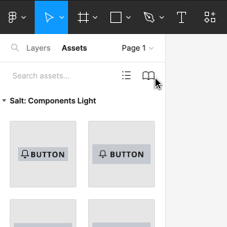
To start using the Salt libraries, enable them directly from the “Assets” panel within your Figma file.
If you’re not a J.P. Morgan employee, you can still use Salt components. Our asset and style libraries are publicly available via the Figma Community.
To use the libraries, duplicate them to your own Figma account. Once the libraries are in your drafts, publish the Salt components within your own team or organization space to use them in your design work. Read more about Community files.

To start using the Salt libraries, search for the @jpmorgan_salt handle in the Figma Community.
Migrating your workspace in Figma
If you’re a community user, you’ll need to follow a migration process once you’ve duplicated the Salt libraries to your Figma project. This involves relinking the components, from your drafts.
To simplify this process, install this relinker plugin. It automatically relinks components from one organization to another.
For more guidance on migrating files, watch this video from Figma.
To start using our components, follow the instructions below.

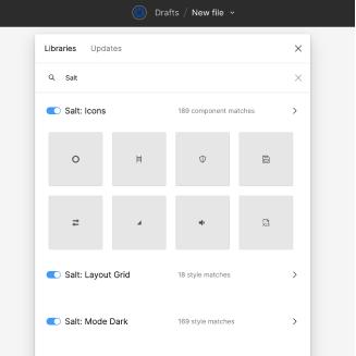
Access the components in the left-hand panel using the “Assets” tab. Click on the book icon and search for “Salt” in Libraries.

Switch on the library you need, for example, Components (Light or Dark), Mode, Theme Palette, Typography, Icons, Layout Grid, etc.

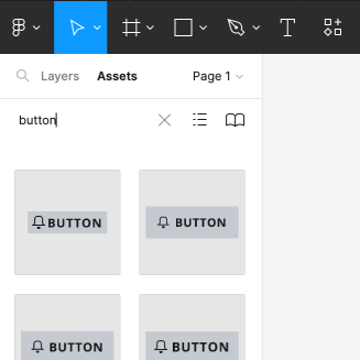
Use the search function to find the component you need and then drag it to your canvas to use it.

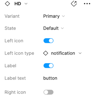
To change density and further manipulate the setup, use the contextual panel on the right-hand side.
If you’ve created your design in one mode and need to change it, use Figma’s Swap Library function to update it instantly—without having to start again.
Learn more about how to swap libraries in Figma.
Semantic colors are the light and dark theme libraries that define colors for specific uses, for example, for containers, separators, actionable components, etc. Colors are preassigned to components, but you can also apply them in your designs.
To access the full range of semantic colors in Figma, you need to enable the Theme Palette library as follows:
- Open the “Assets” panel on the left-hand menu.
- Select the book icon to open the libraries, and then search for “Theme Palette.”
- Enable the library to access the full range of Salt colors.
- Apply the colors using the Fill area (as fill or stroke) that’s within the design panel on the right-hand side of the Figma UI.
Icons are available in SVG format, in three sizes (large, medium and small) and in all four densities.
Although icons are embedded within all of our components, you can change an icon to one that’s more suitable to your specific use case. To do this directly from the icon library, swap the instance using the variants panel on the right-hand side.
Swapping an icon in Figma
We provide two types of icon: default and solid.
Our base size for HD/default is 10px. However, for accessibility and visual design reasons, we don’t recommend icon sizes that are smaller than 12px. Therefore, our default HD icons start at 12px but they increase size in multiples of 10px—so that 2X size is 20px, 4X is 40px, etc.
The default icon set is 12px for both high and medium density, 14px for low density and 16px for touch density. If necessary, you can adjust your icon size according to your UI designs in multiples of 2X, 3X, 4X, etc.
| Size | High Density (HD) | Medium Density (MD) | Low Density (LD) | Touch Density (TD) |
|---|---|---|---|---|
| 1X (default) | 12px | 12px | 14px | 16px |
| 2X | 20px | 24px | 28px | 32px |
| 3X | 30px | 36px | 42px | 48px |
Need support?
For help when manually installing Figma, visit the Figma support page. If you have any questions about Salt’s libraries, please contact us.